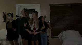
Hello! As my group and I move further along in our movie making process there are some additional things we needed to think about. One of those being that, like our big project last year, we needed titles in our short. We all have some experience with using titles and some background information from our work done last year. The titles that will be integrated are our credits, what production, company, editors, music, actors, costume, and the last being the director. My media group makes up these credits. When editing time rolls around we will split it up depending on who did what. Even though the titles are subtle they can have a huge effect and how the opening in perceived to the audience. Since our genre is horror we want our titles to be striking and an eerie feel to anticipate the viewers for what's about to come. This is very common especially in older horror films like ones in the image above. If we did a more simple or formal font on our titles it might seem like its for a different genre. Coloring of the fonts also plays a role. Last year for our horror two minute opener we used red a red and black font which we are considering using a again. There re so many different variations to choose from. However its important to think about where thee fonts that we want to use are going to be actually available for us to use. We might have to end up using two different software's to use our preferred title. My group and I have been discussing titles and which would best suit the type of short we are trying to make. We came to the conclusion that we would like to use a font similar to Jacmax Horror font or Sorrow Horror Font.
 Hello! As my group and I move further along in our movie making process there are some additional things we needed to think about. One of those being that, like our big project last year, we needed titles in our short. We all have some experience with using titles and some background information from our work done last year. The titles that will be integrated are our credits, what production, company, editors, music, actors, costume, and the last being the director. My media group makes up these credits. When editing time rolls around we will split it up depending on who did what. Even though the titles are subtle they can have a huge effect and how the opening in perceived to the audience. Since our genre is horror we want our titles to be striking and an eerie feel to anticipate the viewers for what's about to come. This is very common especially in older horror films like ones in the image above. If we did a more simple or formal font on our titles it might seem like its for a different genre. Coloring of the fonts also plays a role. Last year for our horror two minute opener we used red a red and black font which we are considering using a again. There re so many different variations to choose from. However its important to think about where thee fonts that we want to use are going to be actually available for us to use. We might have to end up using two different software's to use our preferred title. My group and I have been discussing titles and which would best suit the type of short we are trying to make. We came to the conclusion that we would like to use a font similar to Jacmax Horror font or Sorrow Horror Font.


No comments:
Post a Comment