Tuesday, January 12, 2021

Short Film CR


      A common element that my group’s short film Possessed took part in was the representation of a certain social group and social issue(s). In our piece of work, we primarily represent the social group that is teenagers/ young adults who are just bored looking for an adventure. All four of our characters that follow through our story are all around the same age, 16 – 17. It so happened to be this social group because our group collectively decided that we were going to be the ones who participated as actors and due to us falling within that age group and is who we thusly represent. However practically anyone could be put in our characters shoes and reacted to the peculiar experience just like our young characters did. A couple of social issues are clearly represented in our short as well such as peer pressure and unity. Our character Ava was extremely hesitant and skeptical about entering the mysterious abandoned house, but her friends peer pressured her into coming inside and she didn’t feel comfortable enough to say no due to the pressure she felt from her friends. If this issue wouldn’t have happened, then the horrific mess they encountered could’ve been avoided. Unity was heavily represented as well. Without Morgan and Jake coming together to figure out what had occurred with the mirror and Ava then the secret might’ve never been revealed, and they wouldn’t of been able to save their friend Ava. This shows just how crucial teamwork can be and what a difference it makes.

     When creating our movie package products: our short, social media, post cards etc. we developed all of these for the sake of our brand. We wanted all of them to connect to the idea of a teenage horror film. A big way we did this was in the first presentations of our movie. In our post card, we decided to put photos of our main character Ava in the moments of her possession. When the incident first occurred with the mirror and after her destructive actions have already unfolded. This creative decision  was made because that is the main event of our film and is really on brand with what our movie that because of this, is named Possession. Another main element that we chose to represent that we used for branding was the old creepy mirror. This image of a mirror is everywhere in our marketing and appears like that to get it across that it plays a major role in our film that is horror. We used cliché lighting, fonts, and music that we were all connected and on brand so that it was clear to all of our audiences.

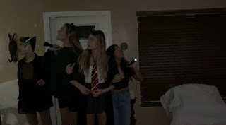
     A significant component that my group and I kept in mind when creating our AICE Media short film, was to ensure that it somehow engages with the audience that we are targeting, because at the end of the day that is who we are selling our product to so we want them to feel as involved as possible. We achieved this goal in a couple of different moments throughout our short film. For instance, several of our camera shots from start to finish are trailing shots from the front or behind. The purpose of doing this was to allow the viewer to follow right along with the characters, as if they were actually with them in the haunted house. We also incorporated a Point Of View camera shot in the scene of my character, Alex, right before she is attacked by her friend Ava. In this particular clip it shows Ava from Alex’s view as Ava’s hand intensely goes to grab her neck. This utilization allows for the audience to experience that same intensity and shock as our character Alex did. Our film Possessed also engages with the audience by having some diversity in the character’s personality. Some more skeptical than the others, some more brave and adventurous than the others, and some more intuitive than the others. With this variety it allows for an opportunity for the audience to have a character that they could possibly relate with somehow based on their personality and therefore builds a connection between them and that character. We wanted our viewers to feel connected to our work and that’s exactly how we did so.

    Each genre of film has its own individual set of clichés and conventions. Before starting such a major project like ours, we wanted to make sure to conduct thorough research on our short film’s genre: Horror. We researched several other horror movie packages to deepen our understanding of the conventions that make up the kind of film we want to make. We researched older and newer horror films and took ideas and styles from both that we thought would fit for us. Doing this intense research heavily influenced our own horror movie package in several ways. It is cliché for horror movies to have striking, gruesome, or eerie titles at the start of their film and that was a major cliché we thought was important to stick with, so we used this red blood drip font to add some of that horror movie character. Another convention we stuck with was the low lighting. Our film was set in an old and dark abandoned house so we didn’t want to turn on and use every single light that we owned or else the scenes would feel lighter and happier, rather than intense and mysterious. Another convention we applied was the style of music we chose to utilize. The music was eerie and would build with intensity through a scene to add some suspense to really get that edge of your seat effect on the viewer. We used spooky horror music, not cutesy coming of age montage music because that’s what fit our genre and our vision for the film.
Short Film Package!

My short film package

Link to short film:https://youtu.be/xkqnh5E8Cws


The Postcard: 
Front
Back:

Friday, January 8, 2021

One last round of editing!


Hello! If there’s one thing I’ve learned from the first half of this year being in AICE Media A level it’s that there’s always more to be done! Always more editing and switching things up! As my group and I were evaluating our short film we felt as though it was still missing something. That it needed a little more storyline in the beginning of the film. More of the four of us walking in through the haunted house and  characterizing it. So that it’s a lot more clear to the viewer what’s going on. Also more build up to the discovery of what’s going on with the mirror and how it’s connected to Ava’s unusual behavior. We wanted to show that side a little bit more. Instead of boom! All of a sudden she’s figured it out. We feel as though with these additions it helps the clips flow together more. After we added in these additions we also re evaluated where our music was and if we wanted to switch that up as well. We added in some here and there or altered the volume to better here the dialogue. We also switched up some of our transitions that we had so they weren’t so basic.  We each individually had great idea contributions that were super helpful when I actually went into the IMovie editing software. With these few final touches I think this might be it. The end of the editing road. We’ve done all that we can and we believe that within the film you can really see all of our hard work in it. I cant wait for everyone to be able to see the film and hear their feed back !!

Thursday, January 7, 2021

Updating our website and working on postcards !


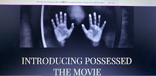
 Hello!! Even though my group and I are nearing the end of our short film journey it seems as though there is always still something to do. Everyday we continue to tweak and add to our different avenues of the project. As I’ve mentioned before my group and I do have a website. We’ve recently added some more info listed on here that we weren’t able to before. Making sure our website is up to date is very important and could heavily effect the success of getting viewers for our film. In the real world and even for this media class. This website allows for others to keep up with our group’s project. We’ve added in more about our plot. Added in new media pictures and dates of releases. Whilst we have been working to better our movie’s website we have also been working on drafting and creating our post cards! Flyer like- post cards are a huuuuge part of marketing for a film of any kind. It can grab the attention of a potential viewers by the cool eye catching graphics and gets them interested. Not only that but it gives them the quick facts that they need about it. Such as release dates and contact info. This also includes social media’s for the film to follow along with the creators. I made the front and back of the post card by using the app Canva. I used pictures shot from our filming days and some other creepy aesthetic background photos to add to the feel we are shooting for. I used titled that matched the tone and color scheme and that were bold/easy to see. We are still drafting and working on them to get the best possible result. But so far so good! I will be making separate updates and posts about the finished post card later next week! 

Tuesday, December 29, 2020

What’s need to be redone for our film


Hello and welcome back again! It’s a bittersweet feelings that my group mates and I especially are experiencing as we near the later end of our project. We’ve put in so much effort into this short film within these past few months. Lots of planning and directoring and filming and decision making and editing. The list goes on and on. But as I’ve recently piecing together all of the first wrap of film we’ve got I saw what parts aren’t working in the way we would like them to. This means we needed to refilm some scenes. There weren’t any MAJOR parts that needed to be fix. It was mostly little things like positioning and making sure things lined up smoothly and made sense. After we were able to get it all the way we’d like them it came time for re editing. I feel as though we are constantly re editing. Adding in and cutting out parts. The editing part is one of my personal favorites. And now after we did some re filming I helped in re edit and adjust these clips. This part of the process, I’ve learned is so crucial. Because I always want to be improving my work and making it better. And the way I do this is collaborating with my group and keep going back to edit our short. And so far this method has been working great. It’s a good practice too. This what the real filmmakers do all the time, it’s a constant cycle. I believe we’ve all done our best and gave this project our all. And I believe it’s really going to show in the final product. 

Sunday, December 27, 2020

Adding in titles to short


Hello! And welcome back! We’ve come a long way in terms of the progression of our short. The last piece before we have our first complete draft is adding in our titles. A very important part in the production of any project is the credits. Accrediting to those who took part in the work. We have to include actors, writers, editors, costume, director, and many more. Each of these consists of one out of my 4 group memebers. As I said before in previous blogs, the way in which these titles appear has a huge impact on the overall feel. I discussed with my group our options on what we wanted to do. We wanted something similar to what we used in our two minute movie opener last year. So I knew we weren’t going to be able to use any of the fonts provided by IMovie since they are so limited. That’s when I suggested to Jake we utilize the same website that we found last year. We agreed that this would be the best solution. We worked together in picking location and timing for each of our titles along with the font itself. We made sure to space it out enough that they were readable to the audience. Not only that but the order of them as well. I made sure “Directed by:” was last on the list. We also made sure that these titles were only in the beginning and didn’t take up the full short film. Because that wouldn’t be realistic. I believe the one we choose looks great and it really adds a lot to our film. Our movie gets better and better as the days go on. I cant wait to begin sharing our work with everyone!! 

Wednesday, December 16, 2020

Beginning of editing


 Hello and welcome back! We've done our planning. We've done our filming. Now it's time to edit. Since my group and I did all of our filming on our phones, this made the editing process a lot easier. There was footage on all our phones so we shared all of them to each other via AirDrop and IMessage. The first editing software that we used was IMovie. The first thing we did was go through our clips and selected which take we wanted for each scene. Then I opened the IMovie app and selected each of those and put them in chronological order. We took some time watch some clips together to see how it ran together. Then we cut and clean up parts to not make it so choppy. We got rid of parts that we didn't need or parts we stuttered in while acting. As we went along editing our clips we had to keep the run time in mind. Our finished short should be around 5-6 minutes. So we had to make sure it fit that. Turns out we ran a little over what we thought it was going to be. So we all got together to discuss this. Picked which parts could be shortened or taken out to get it to be the right time. Then we picked where our special effect sounds and music should go. We used the song Rob Zombie in the beginning of our film where the titles would begin. We felt like this alongside some non copyrighted horror background music really added to the creepy effect we were looking for. We've come a long way in piecing together our film, but it is not done yet. There's more to be done. We still need to add in all of our titles. However we are going to need to use a different software than IMovie. The reason for this being that this software doesn't have the font we would like. So our next step is to talk as a group to figure out what software to use to get our perfect fonts!

Short Film CR

         A common element that my group’s short film Possessed took part in was the representation of a certain social group and social issu...